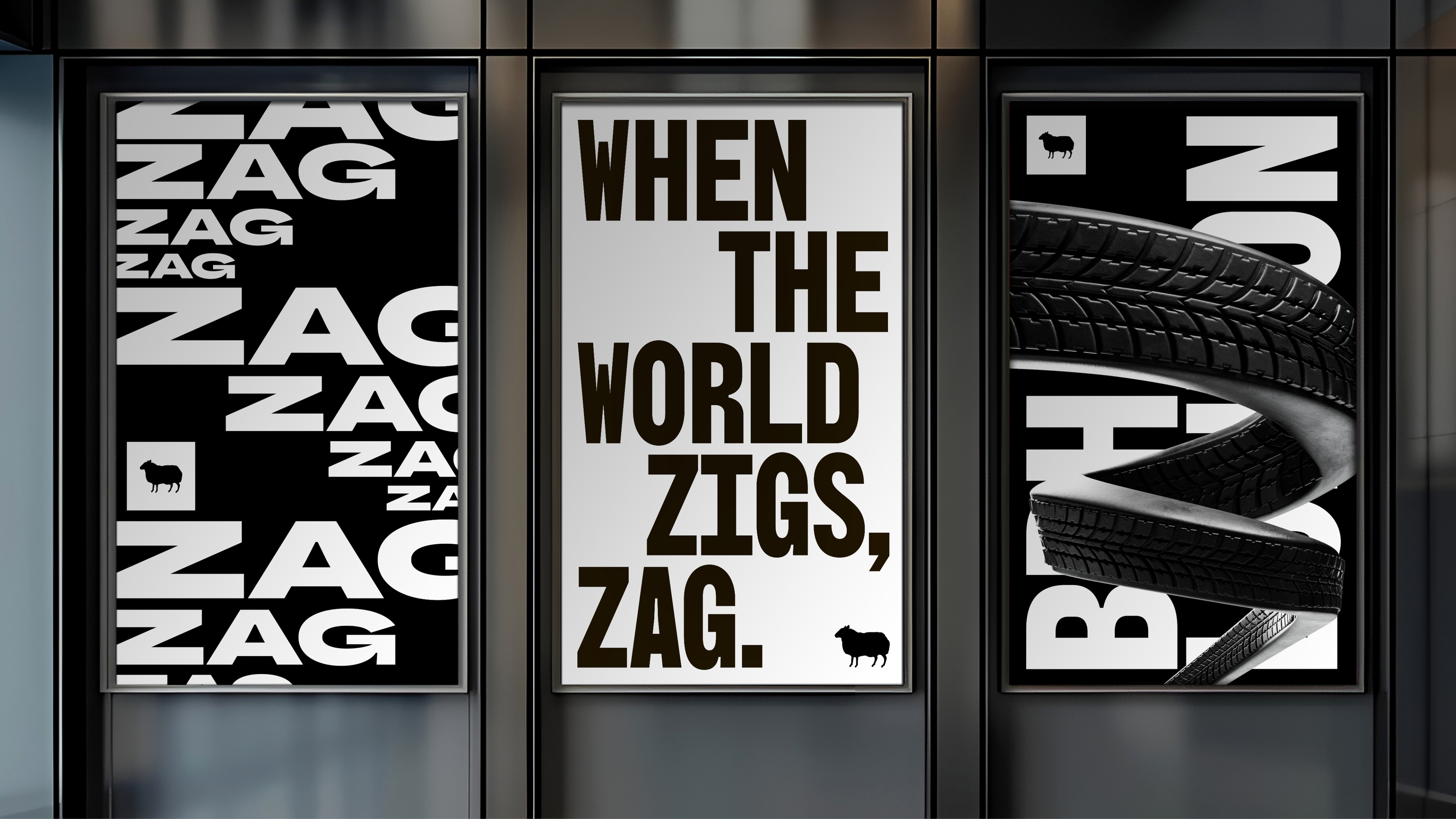
Introducing the BBH Rebrand.
We asked ourselves a simple question: How do we show the world who we are now? The answer was already in our DNA: Difference. The Black Sheep. When the world zigs, zag.
So we didn't just refresh our brand; we rebuilt it from our most essential truths.
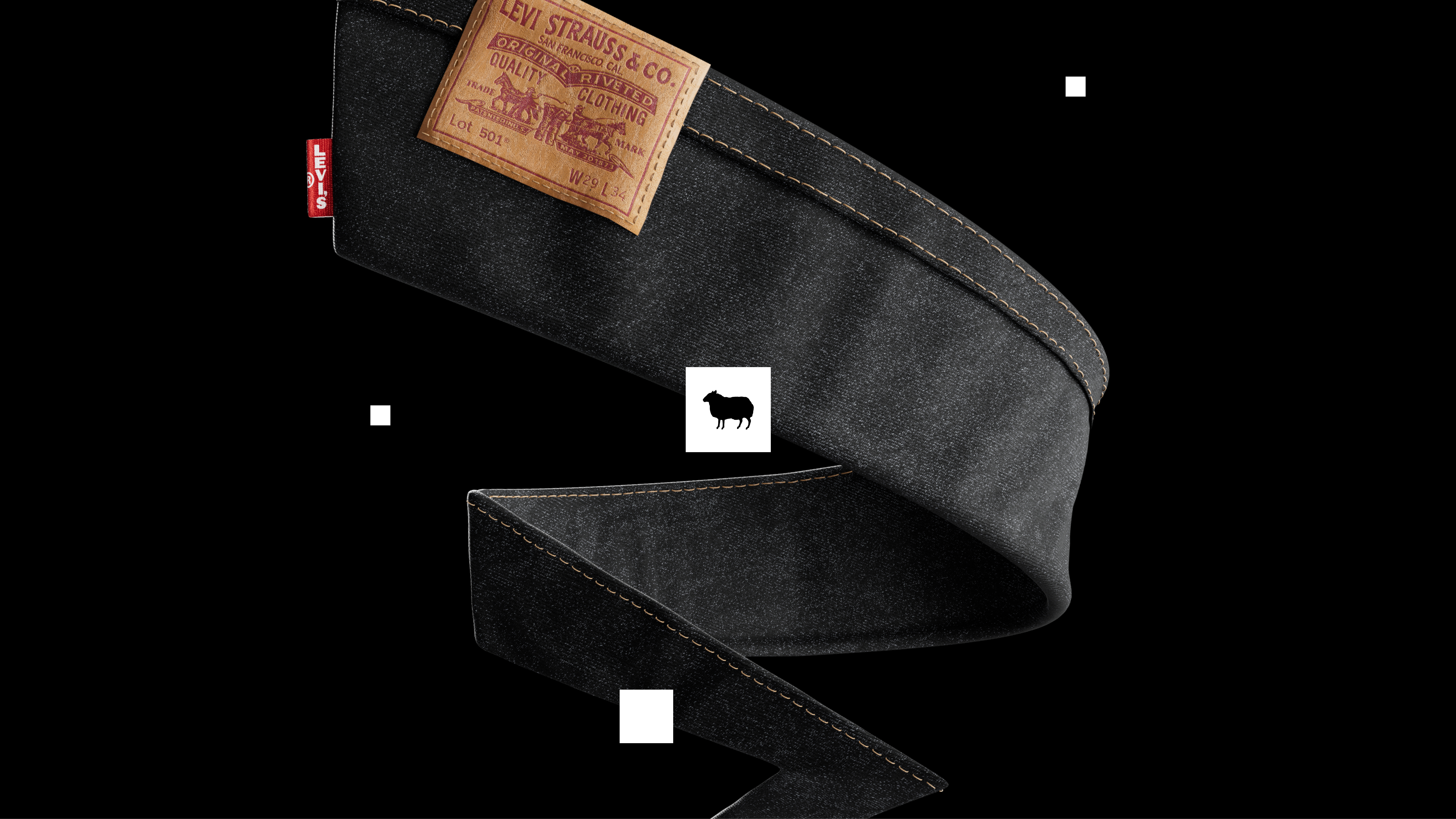
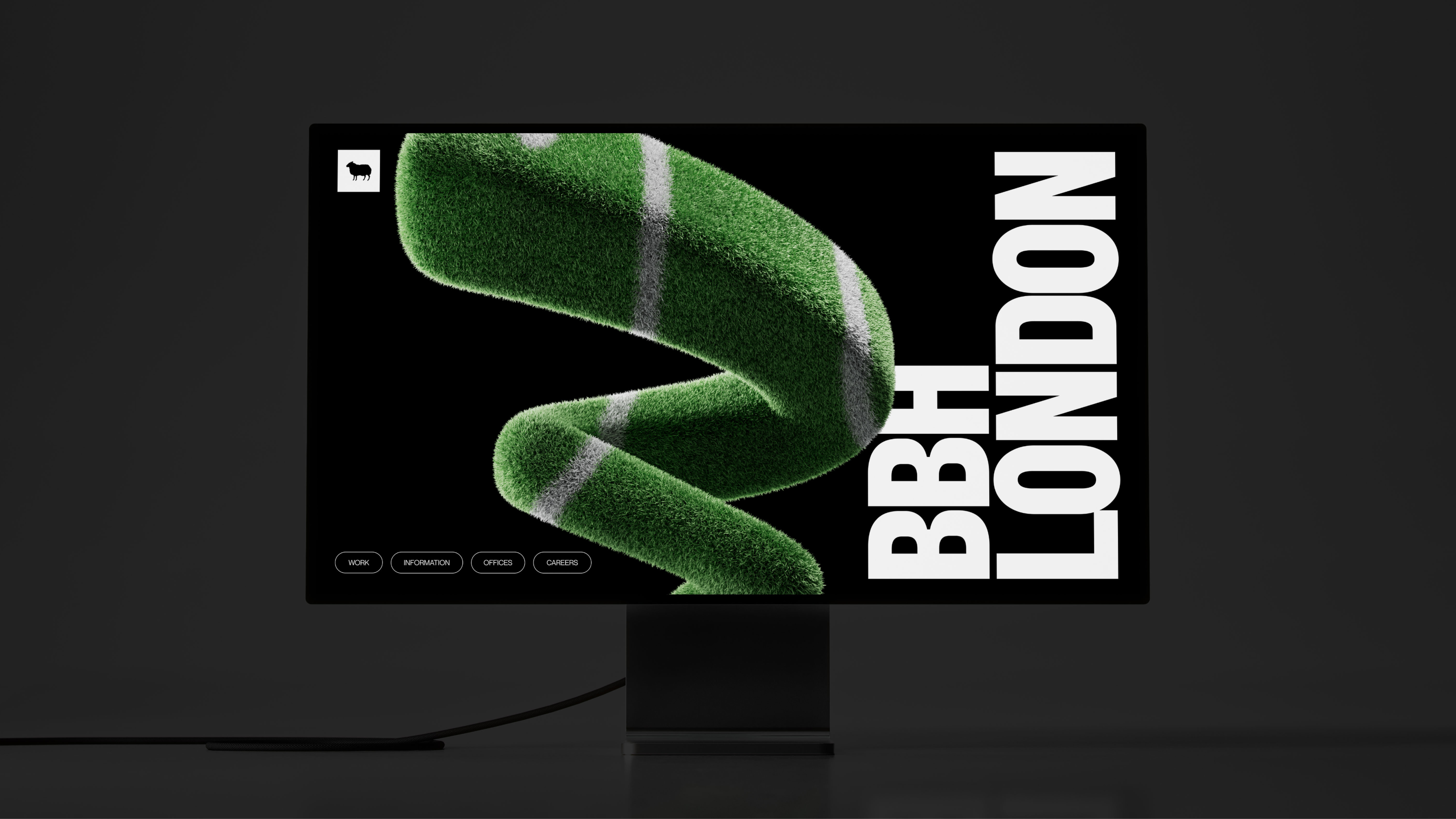
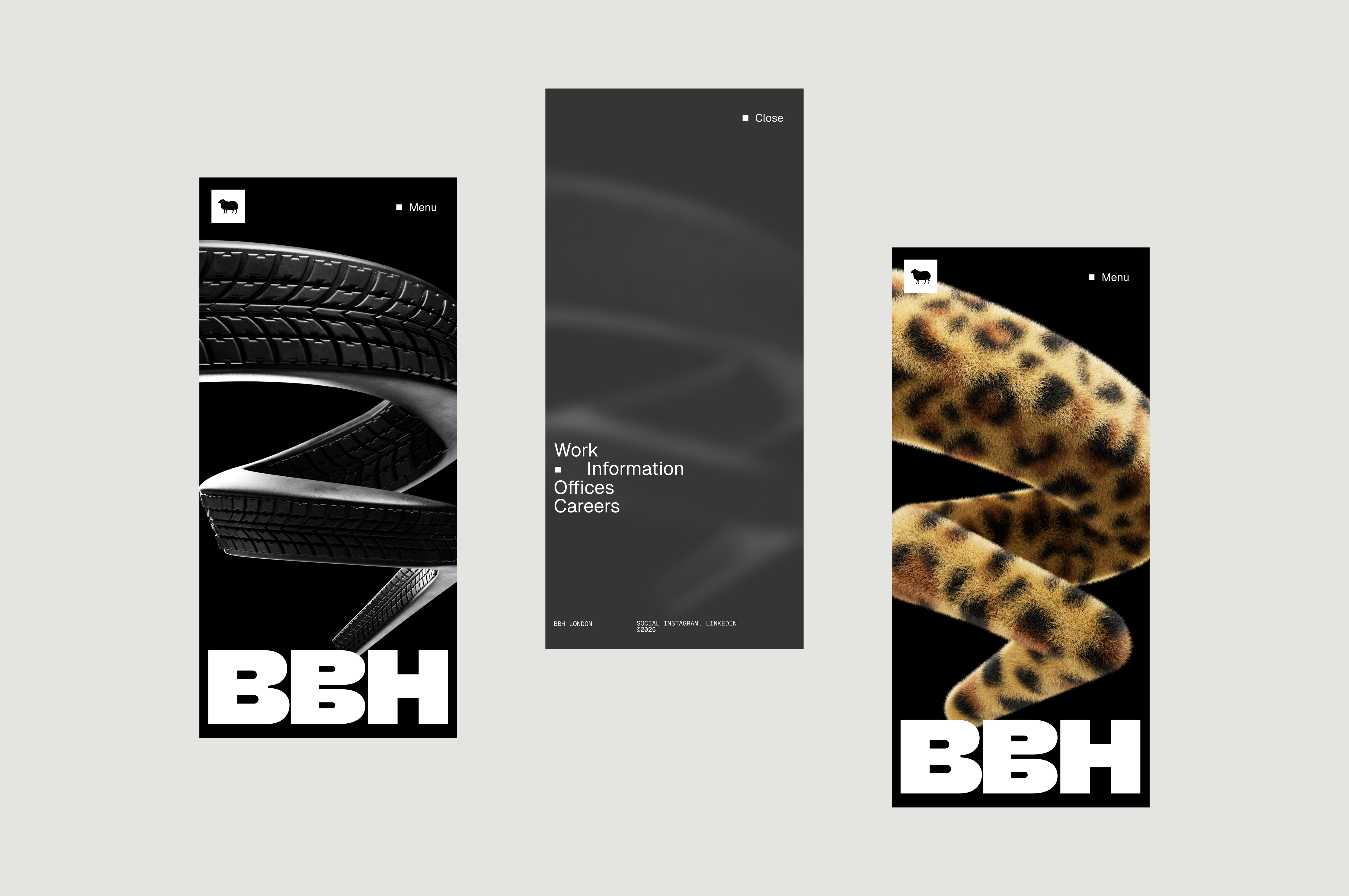
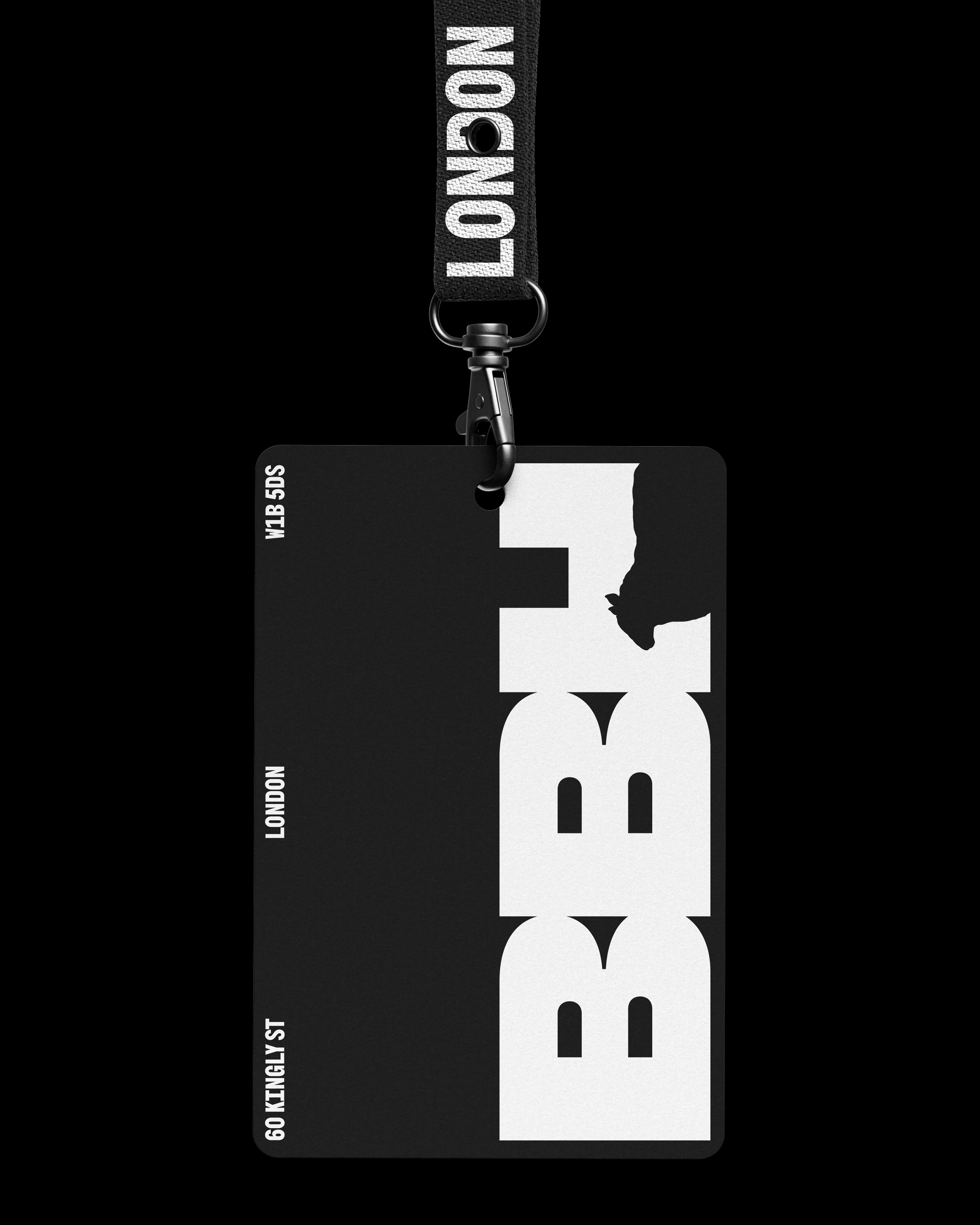
Our new identity is a simple, confident system designed to put the work first. It’s built from our square logo, which becomes the grid for everything we do, creating a quiet stage for brave ideas to stand on.
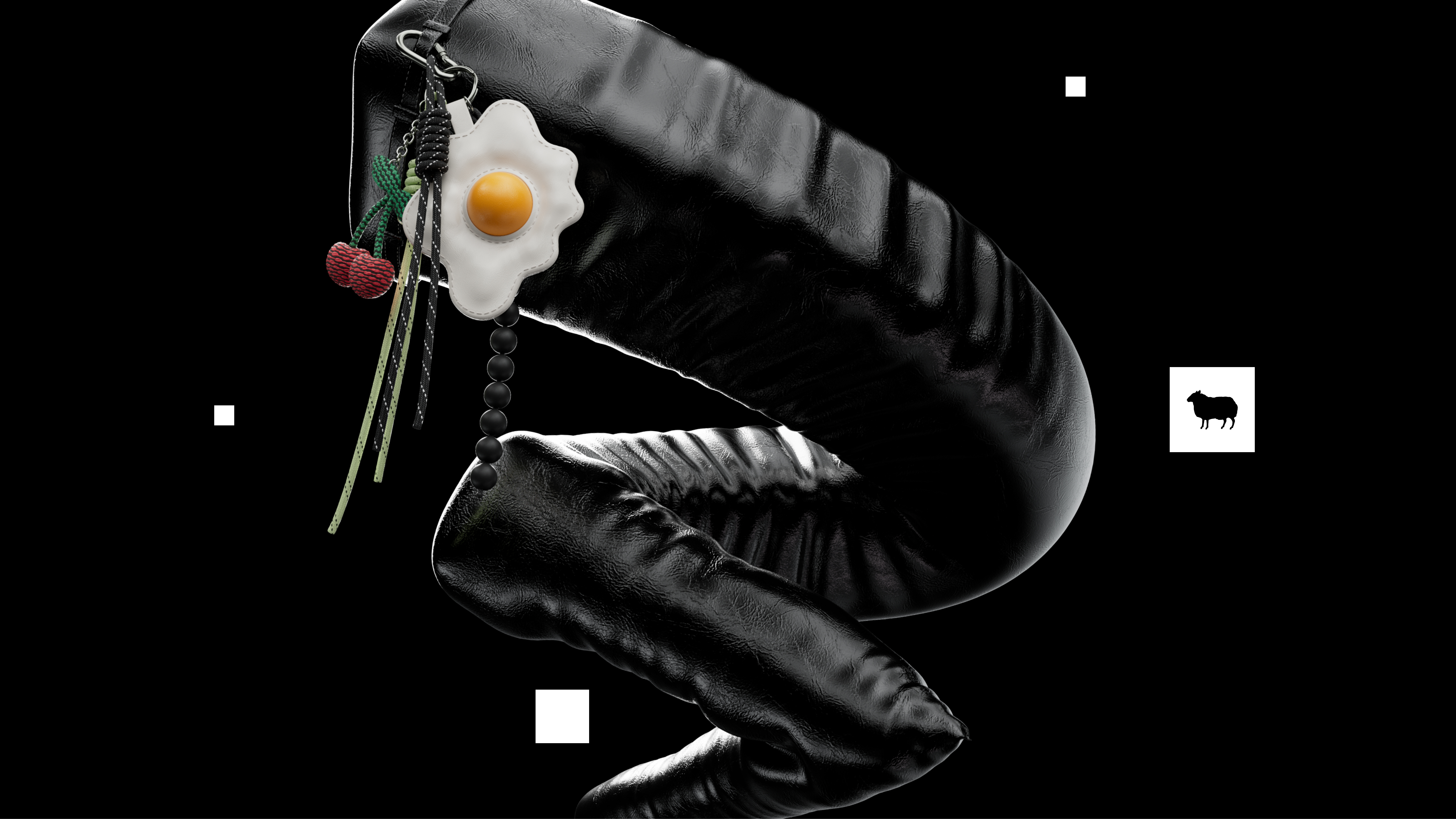
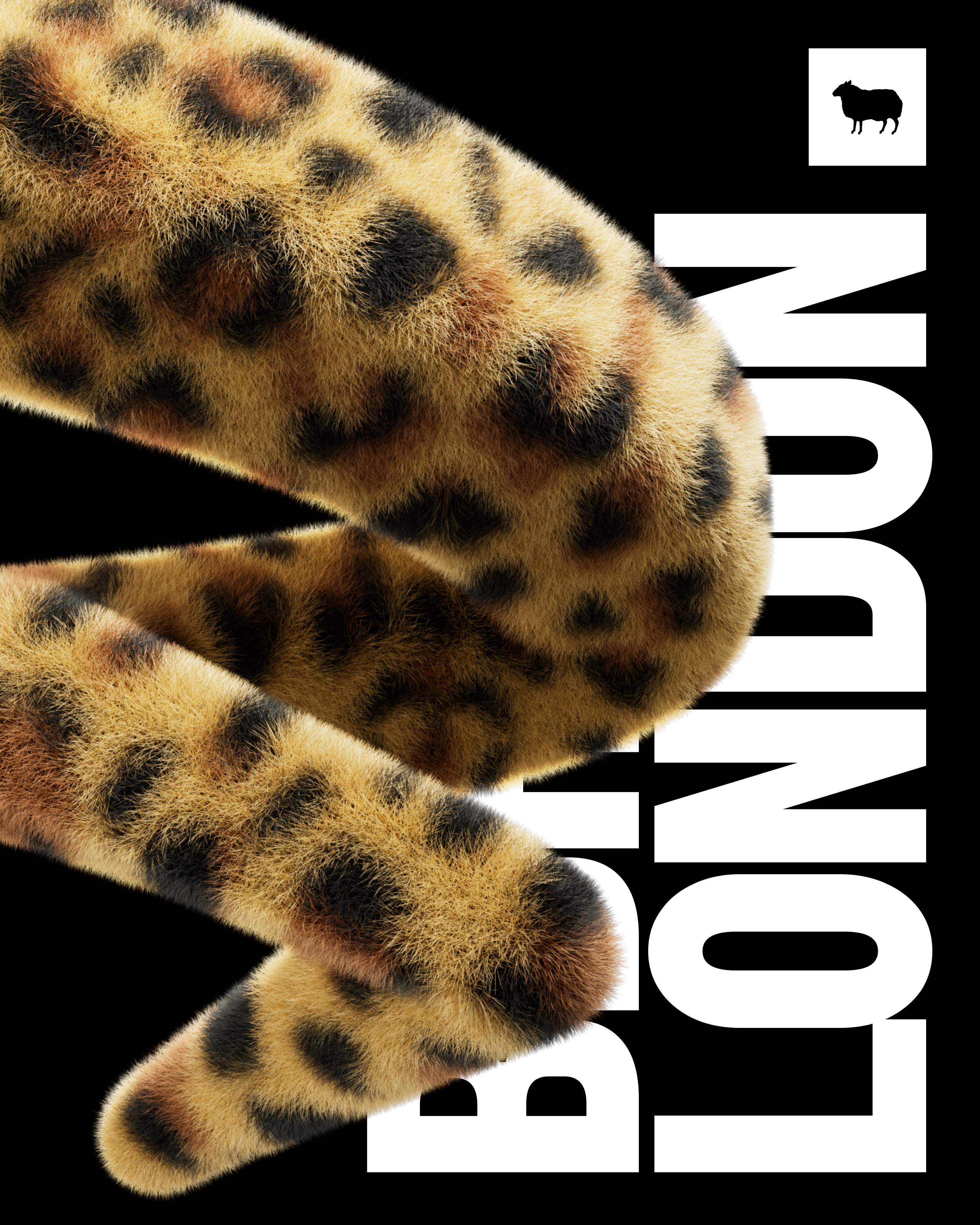
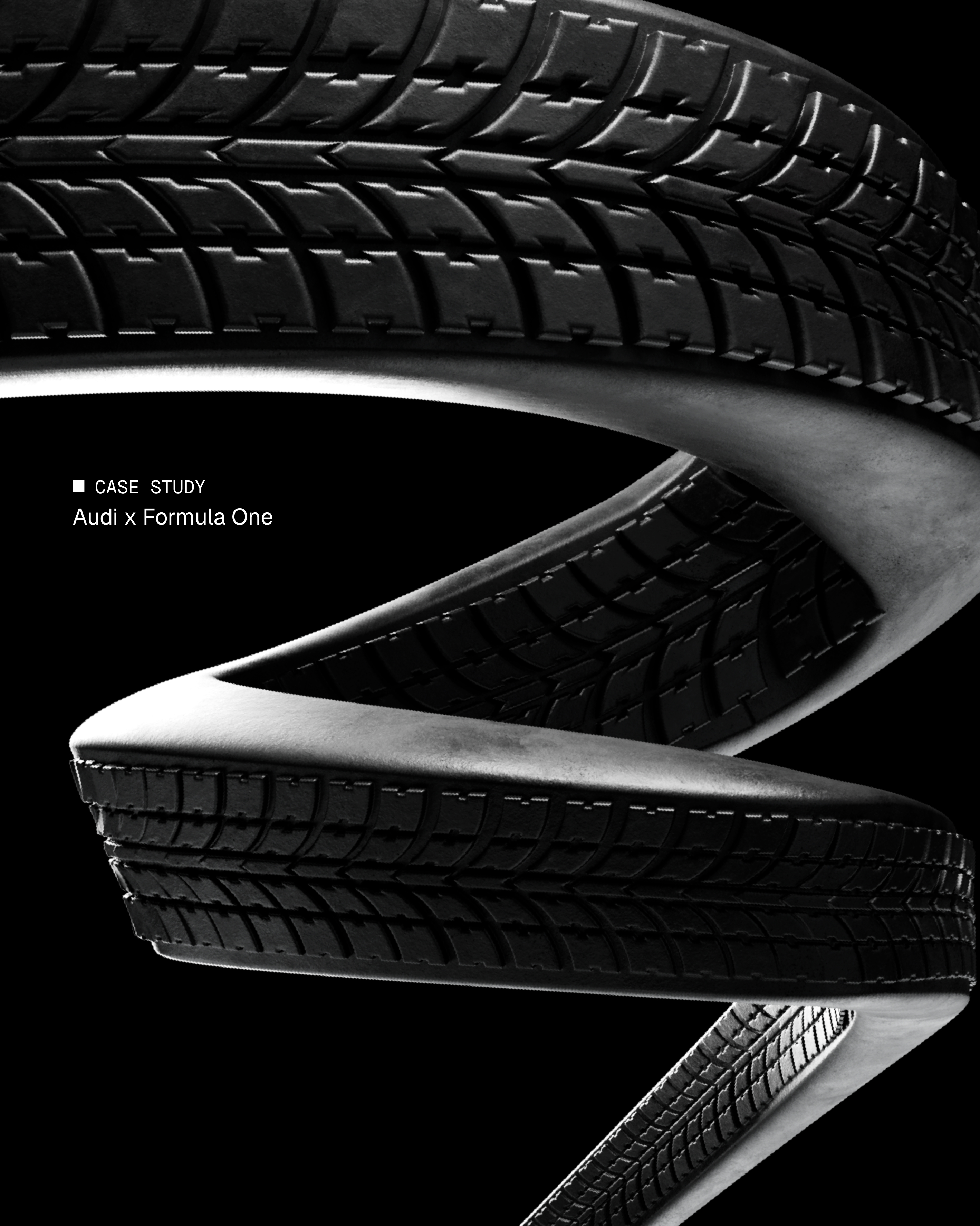
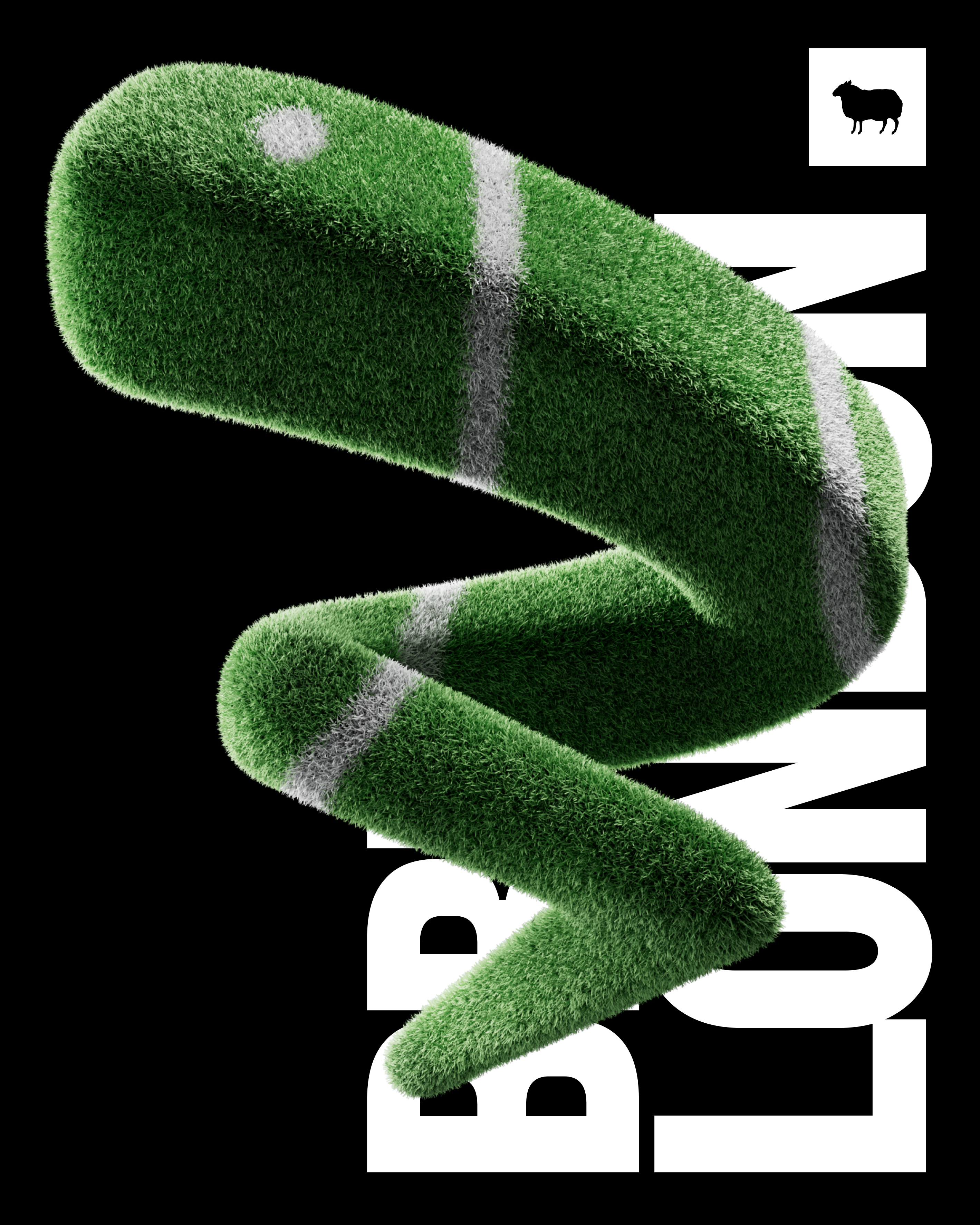
Our philosophy of "zag" is no longer just a tagline; it's now a literal, living part of our brand. We created dynamic, 3D Zags that cut through the noise, celebrate our partners, and champion our thinking. It’s our rebellious spirit, given form.
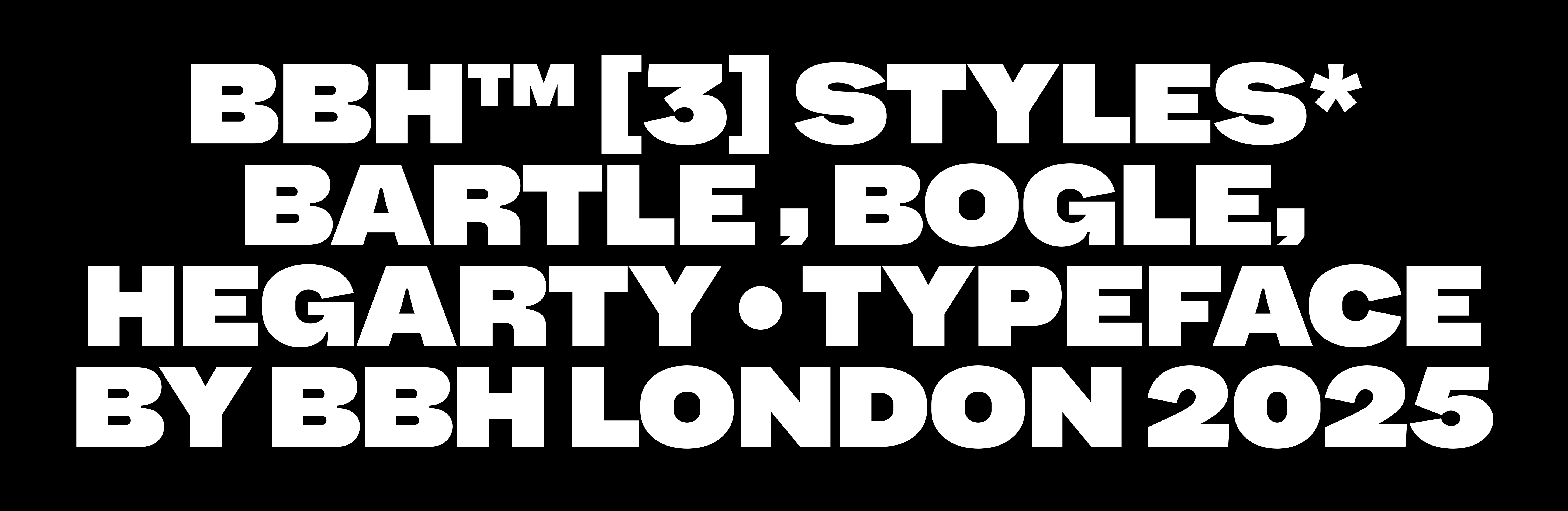
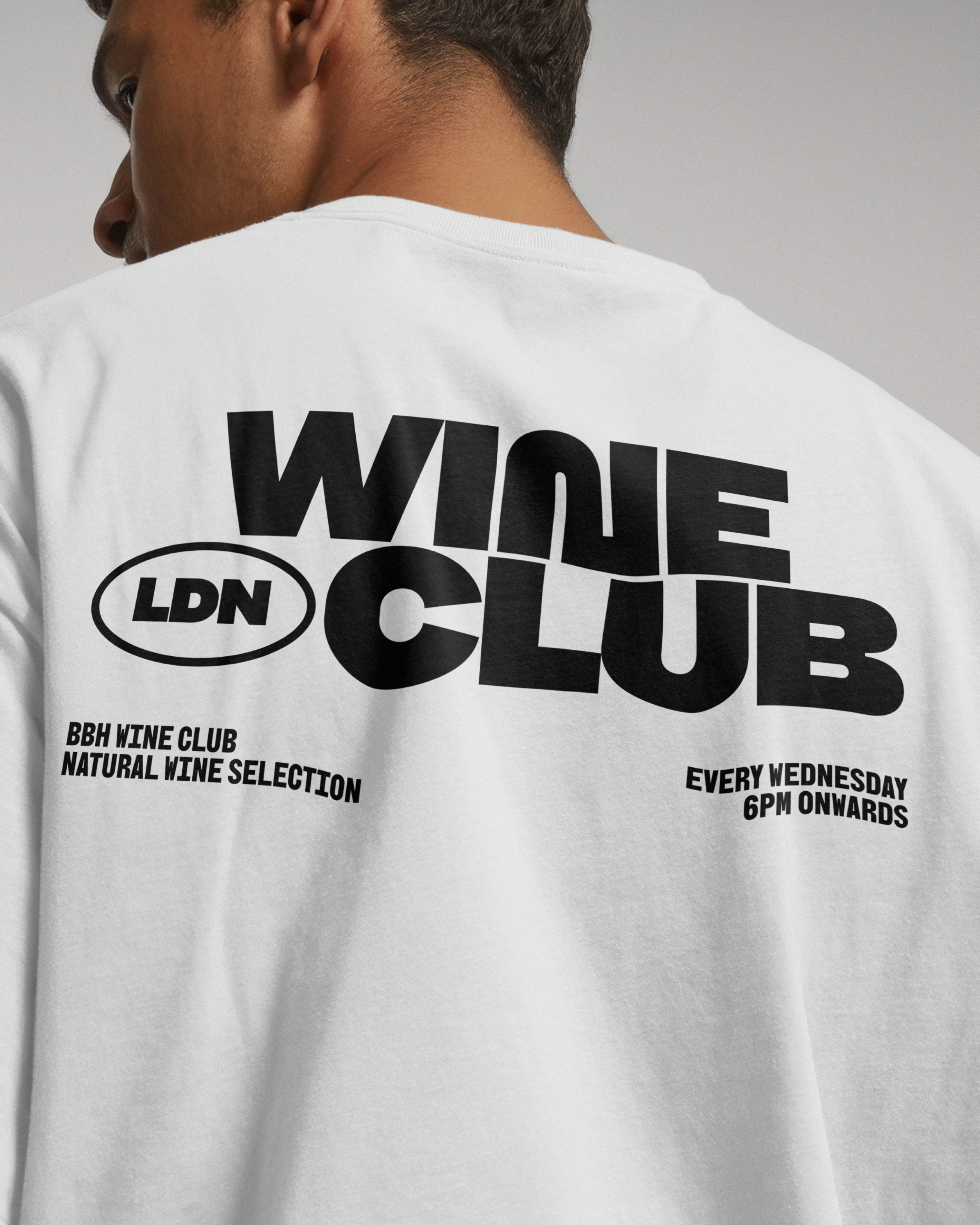
And in our biggest zag of all, we created our new bespoke typeface, BBH Sans, and gave it away. This act of rebellion is now available to the entire creative community for free on Google Fonts—a tool for everyone to find their own difference.
This is the new BBH.
BBH SANS
How do you bottle the spirit of an agency? How do you take four decades of legacy and shape it into a tool for the future? You don’t just create a typeface; you create a statement.
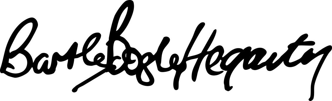
Introducing BBH Sans. Named in honour of our founders, the Bartle, Bogle, and Hegarty Display weights carry our history, but are designed to look forward. It is the graphic language of our future.
At BBH, we believe that when the world zigs, you must zag. A typical agency would lock its new typeface away. But that’s not us. Our zag is to set it free. BBH Sans is now available to the entire creative world on Google Fonts. This isn’t just our voice; it’s an invitation to find yours.